Charged with a mission to great the "perfect" greeting card and t-shirt design for 1 user, I created an interactive and encouraging card which reflects the care and attention that my user Audrey Young places on her interpersonal relationships, and a t-shirt design that illustrates the interconnectedness of her many homes.
This piece is the product synthesis of a 1 on 1 interview with Audrey Young, a Harvey Mudd Junior, my reaching out to her brother, and an exploration from designers that I draw inspiration from.
scroll to bottom to see a full explanation.
LET IT FLOW...
first the greeting card
Final Digital Product
The Ingredients of the card
First draft digital product
Audrey with the final product!
Explanation
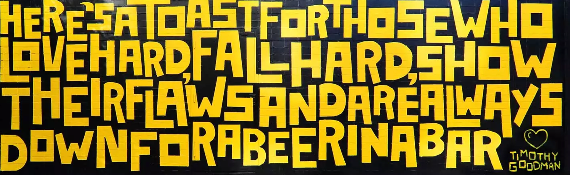
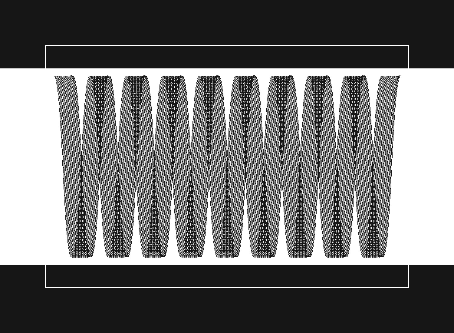
For the design of the cards, I was inspired by something Audrey told me in our initial interview. She said that amidst all of her travels she has developed strong relationships with her friends and family by spending quality time and sharing experiences with them, and that she likes sharing experiences with new people. It is for this reason that I wanted to make a card that could be used to share an experience with someone. An interactive card; a gift that keeps on giving. In my initial design I used a graphic of a pulsing heart because Valentine's Day was coming up and the phrase "let that shit go" as something to remind her to not get too stressed about schoolwork (something she also mentioned in the initial interview), but in my correspondence with her brother I was told that she doesn't cope with stress in that way and she would prefer something more akin to a river. I was also inspired by the primary designer that I researched for DP1 by the name of John Maeda. His very distinctive style is comprised of repeating lines and curves that offer a textured look to the pieces he makes. I took this inspiration and the feedback from her brother that I could have the gift card make an interactive experience and something hinting at a river.
Now the T-shirt Design

Explanation
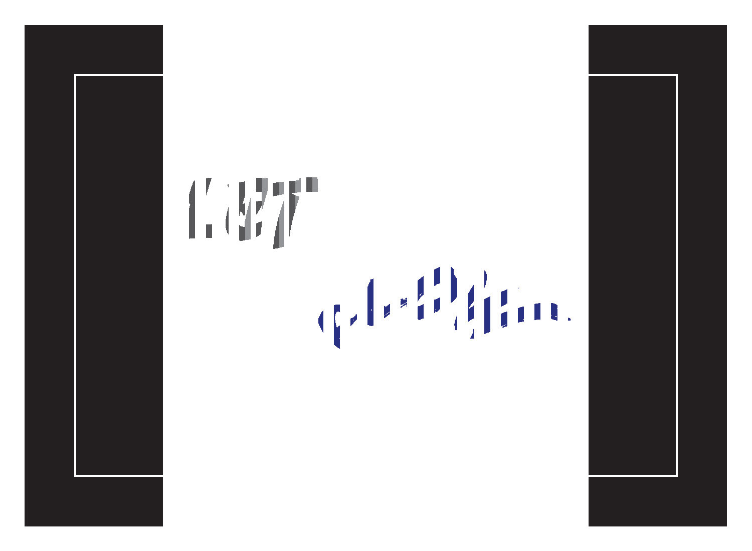
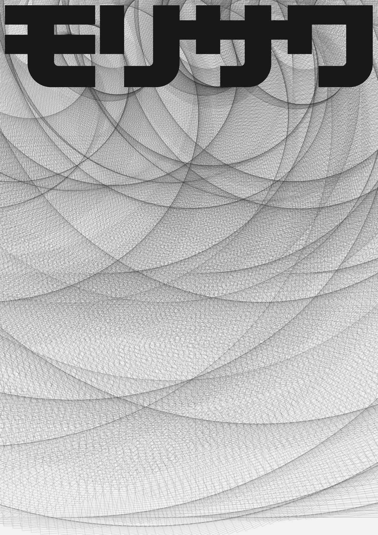
Initially, I drew from my interview with her where she said she has lived in 5 different places before coming to school at Mudd. She was born in the Bay and traveled with her family to live in Kyrgystan soon after where she calls home. I manifested this part of her story in my design first by placing all of the places she lived on the shirt and then by manipulating the letters to attempt to communicate in the design that the places she has lived have had influences on each other. I chose to emphasize Kyrgystan in the structure of my design by use of hierarchy. I did this by a filling the letters of Kyrgystan. Also, because I wanted to emphasize that she has taken her home with her everywhere she's gone I also filled the letters that appear in Kyrgystan "K," "y," "r," "g," "s," "t", "a" and "n" in the words of the other places. I did this for each of the other occurrences of those letters except 1 for each letter because, I wanted to emphasize that she also learned new things from those places and open to interpretation. The design of this was also inspired by Timothy Goodman Elysian Wall you can see this in the way the letters interact with each other.